01 /NRG Health & Fitness
Fitness / Ireland
Same business.
A stronger
first impression.
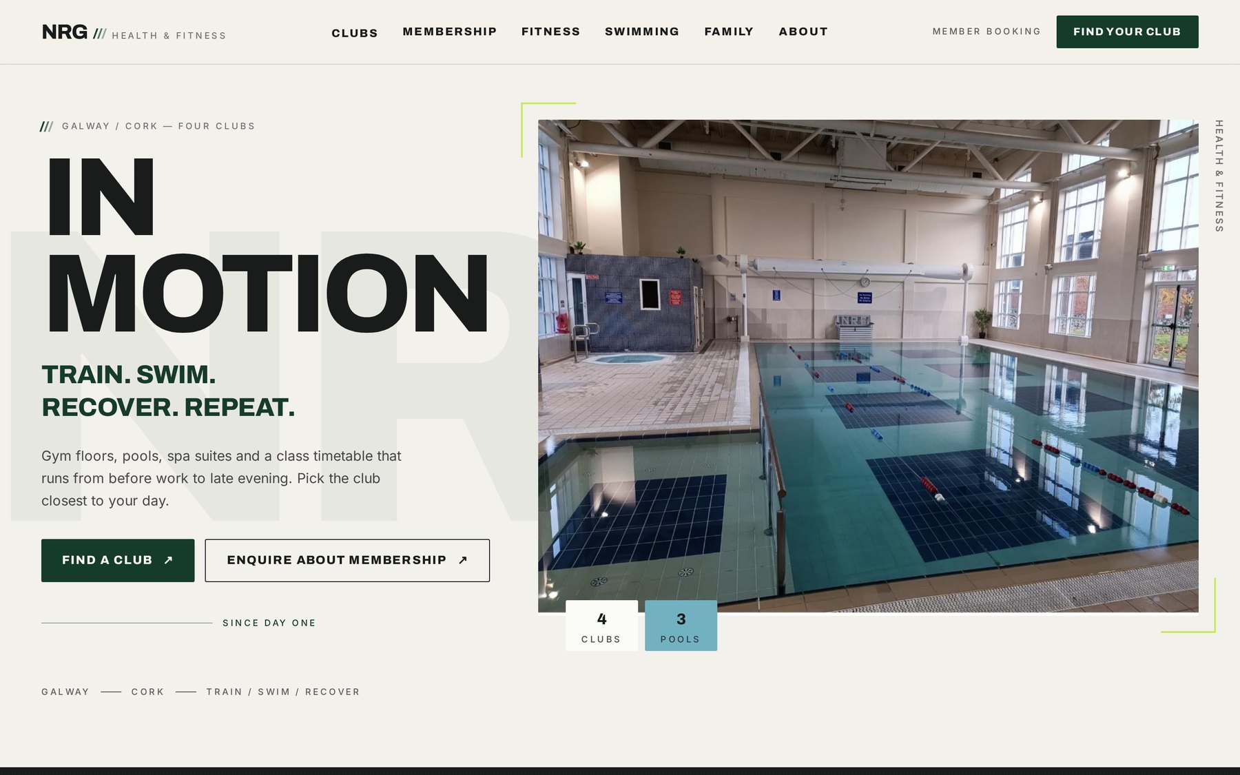
An independent redesign study of the NRG Health & Fitness website — restructured, rewritten and redesigned to match the standard of the clubs behind it.
- Project
- Website Redesign
- Discipline
- UX
- Words
- Copy
- Direction
- Visual Direction
- Sector
- Fitness / Ireland
An independent redesign study, produced on my own initiative to show how the existing business could be presented.
02 /The starting point
Nothing missing. Just harder to read.
NRG already runs four clubs across Galway and Cork, with gym floors, three pools, spa suites, a family offering and a class timetable that runs from early morning to late evening.
The challenge was never to invent a different business. It was to present the business that already exists more clearly — and to make the first ten seconds on the website feel like the clubs themselves.
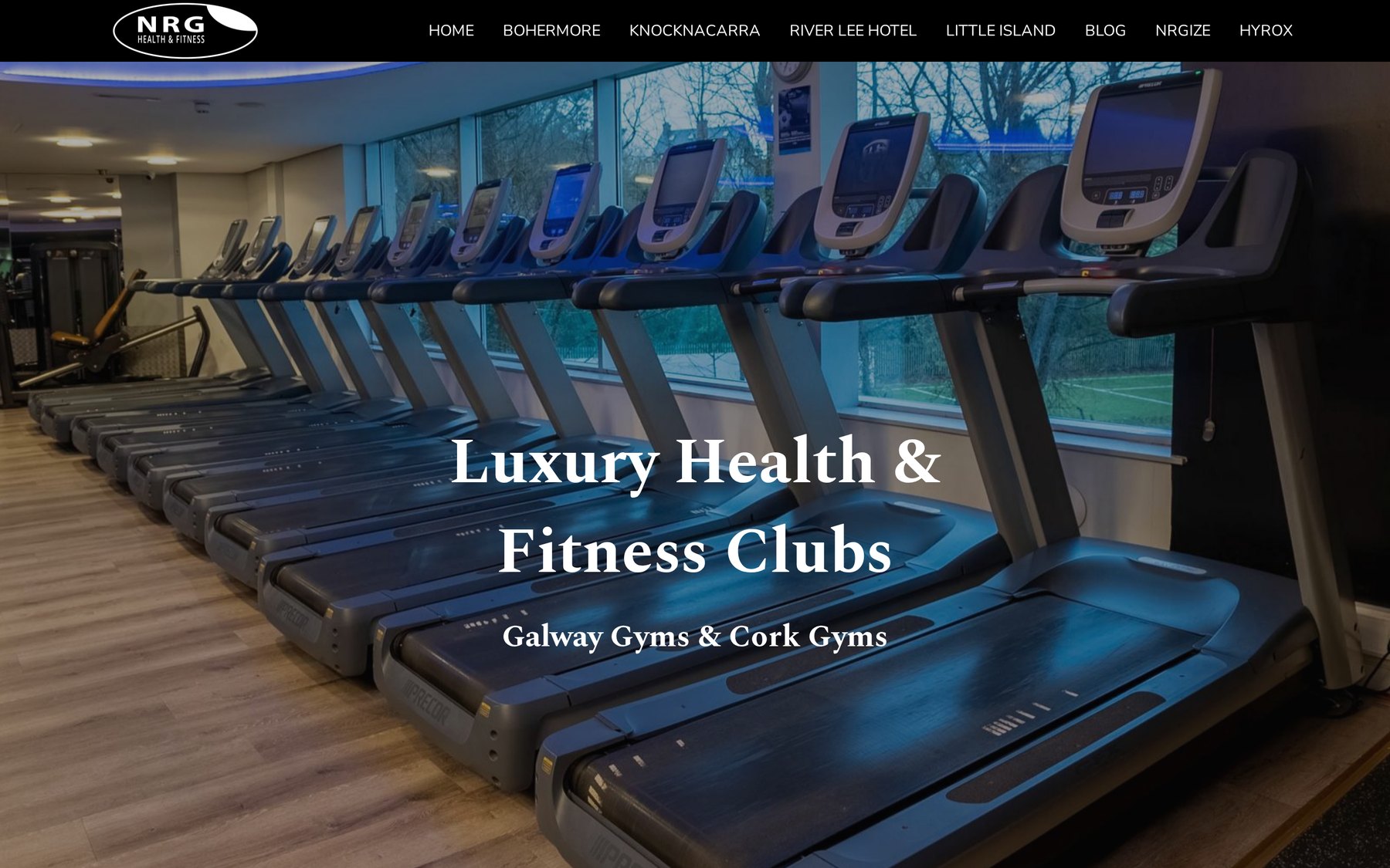
Original — homepage
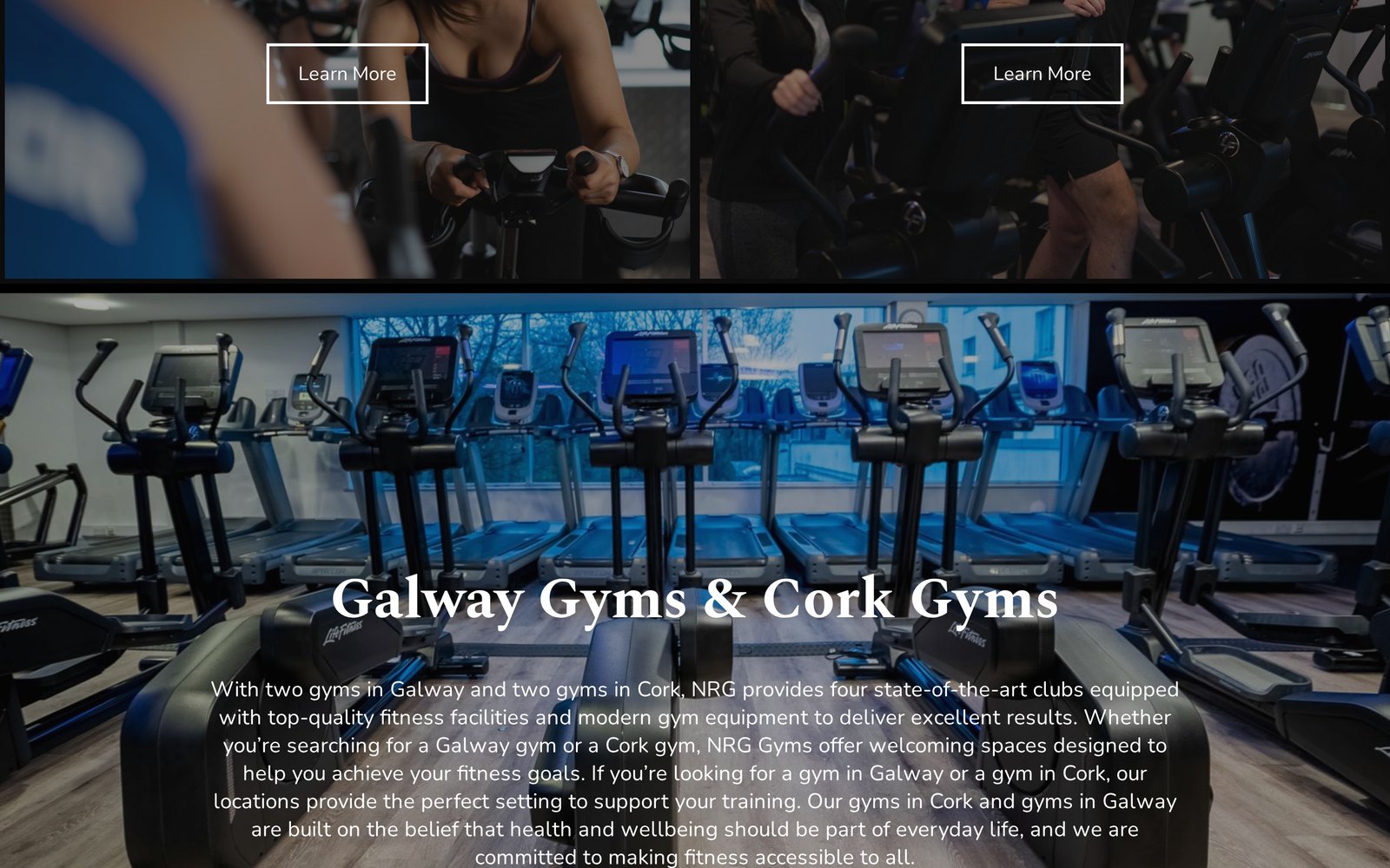
Original — long-form section
03 /Before / after
Drag to compare
BeforeAfter / Aucate ↗04 /The thinking
Eight decisions,
before any
decoration.
Every change below answers a question a prospective member is already asking: where do I train, what do I get, is this for someone like me, and how do I start?
- 01Clearer visual hierarchy
- One thing to read first on every screen, instead of five things competing.
- 02A stronger first impression
- The opening screen states what NRG is, where it is and what you can do next.
- 03Locations presented properly
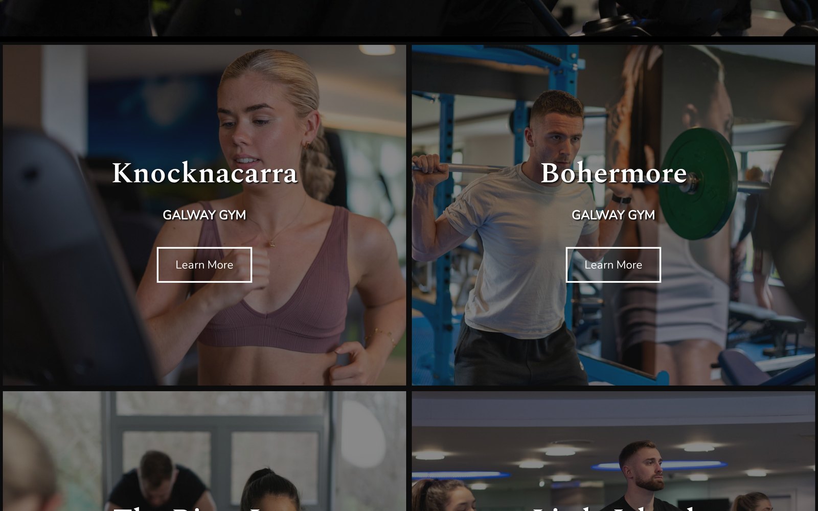
- Four clubs, compared side by side, so nobody has to guess which one suits their day.
- 04Facilities and services in plain language
- Gym floors, pools, spa suites and classes described in the terms a member actually uses.
- 05A more intentional journey
- Browse, narrow to a club, understand membership, enquire — in that order.
- 06Stronger calls to action
- Find a club and enquire about membership are always within reach, never buried.
- 07A rebuilt mobile experience
- Set again for a small screen rather than shrunk down from the desktop layout.
- 08Contemporary fitness positioning
- A tone that reads current without abandoning a long-established local business.
05 /The redesign
Full pages, real screens
Type doing the heavy lifting. Photography doing the rest.
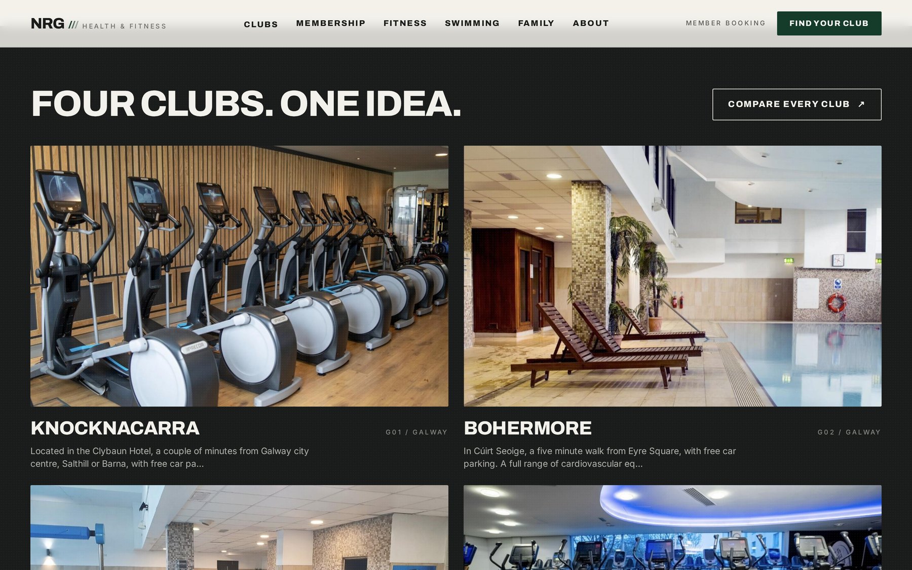
Fig. 01 — Four clubs, compared on one screen
06 /Desktop
1440px
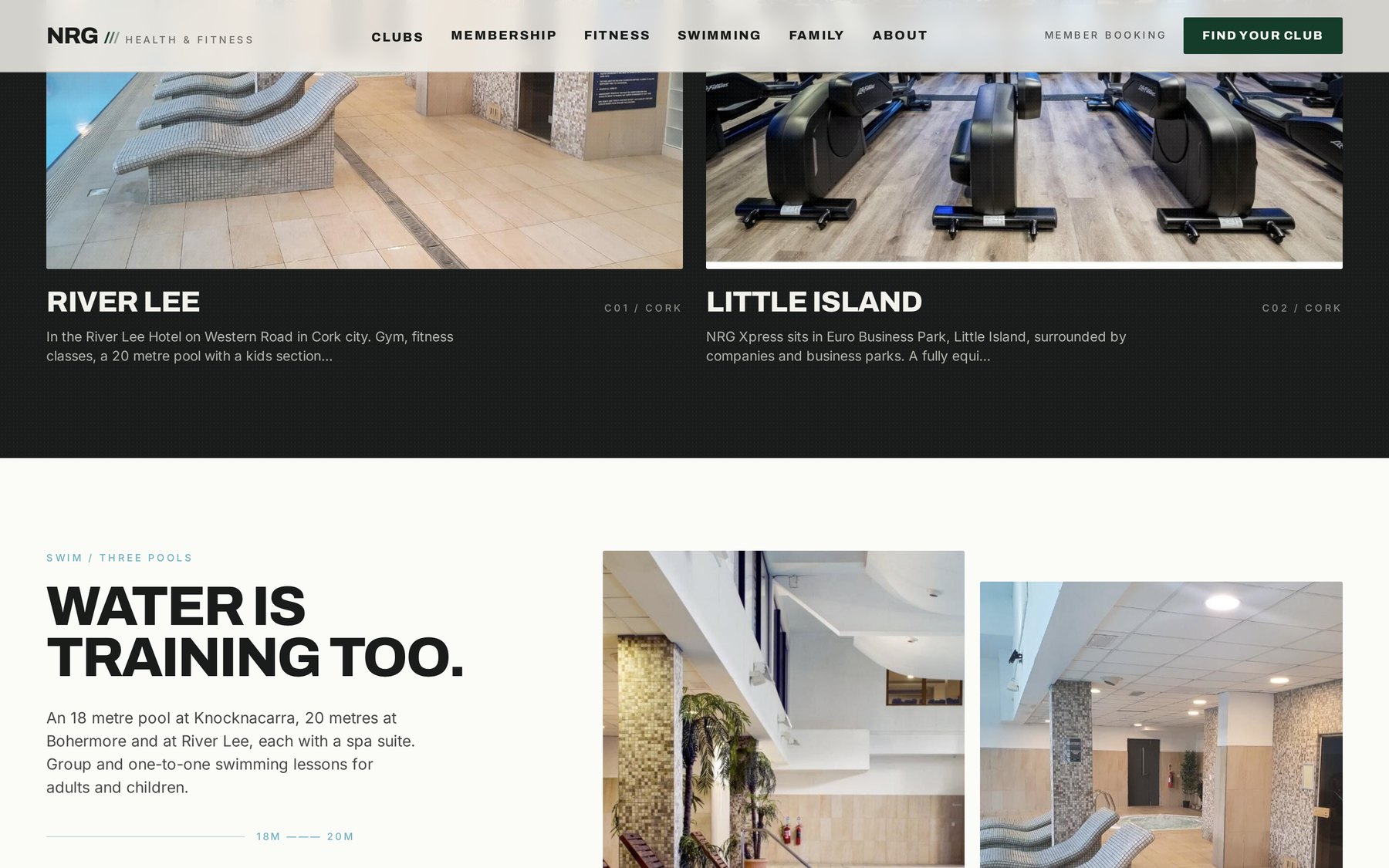
Swimming — pools and lessons
Each section leads with a plain statement, then earns it with detail. Facilities are grouped the way people actually shop for a gym: what’s in the building, when it’s open, how close it is.
Rules, numerals and a single accent colour hold the pages together without adding ornament.
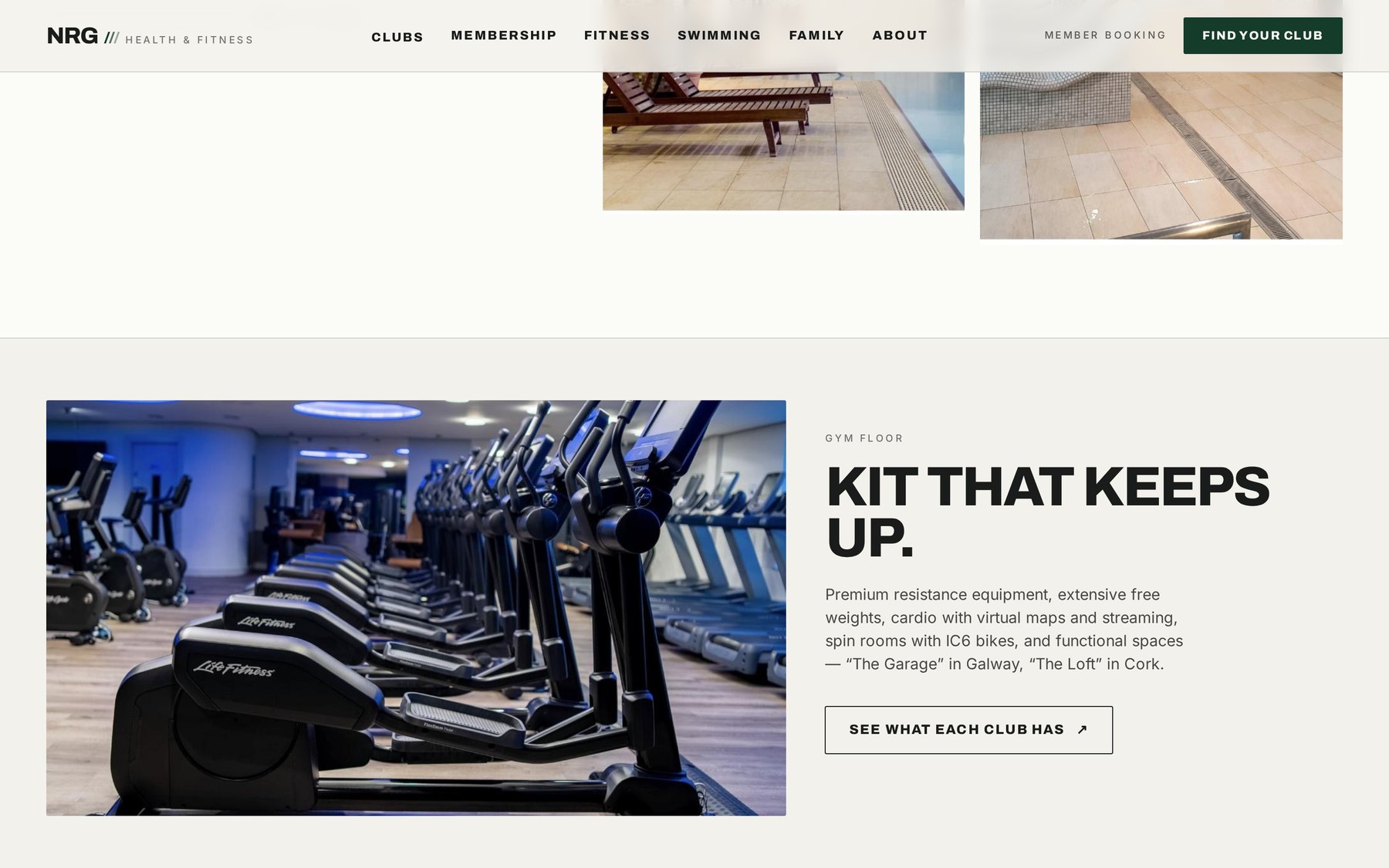
Fig. 02 — Gym floor and equipment
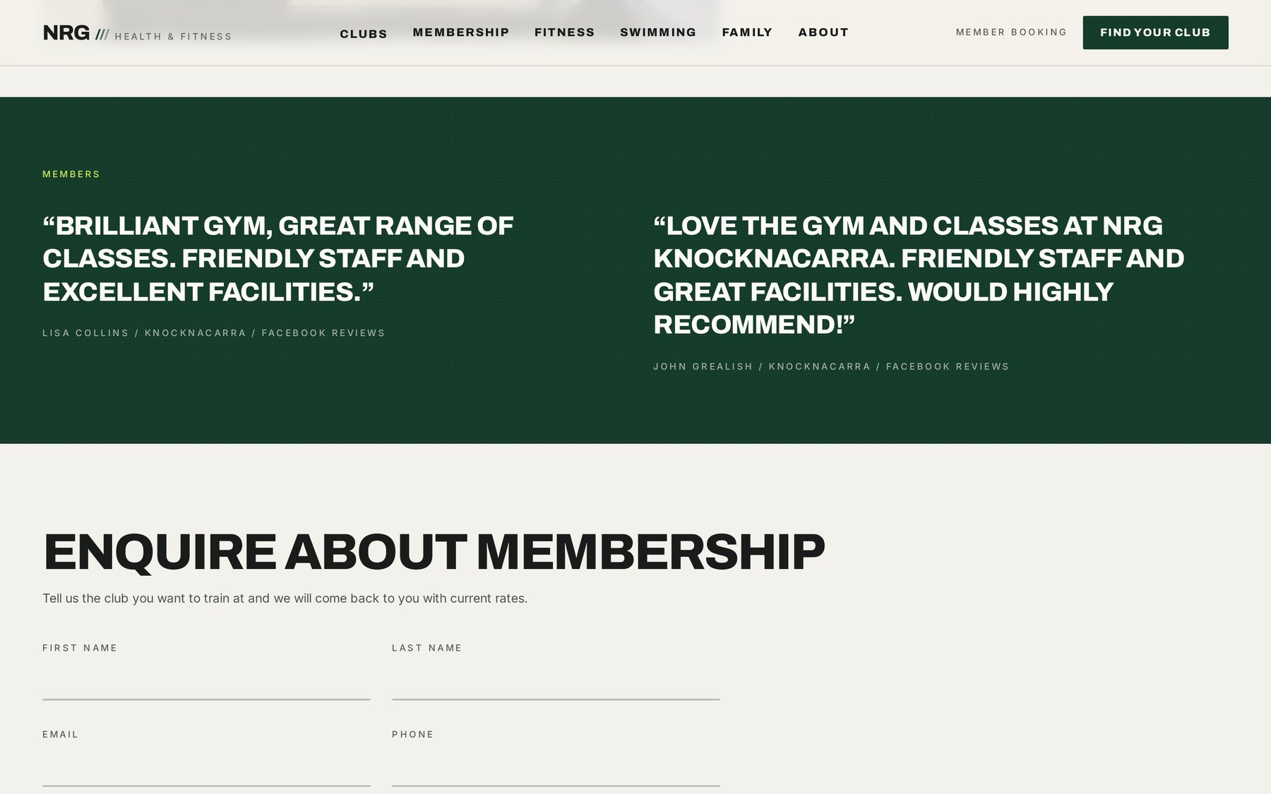
Member words, then one short enquiry form
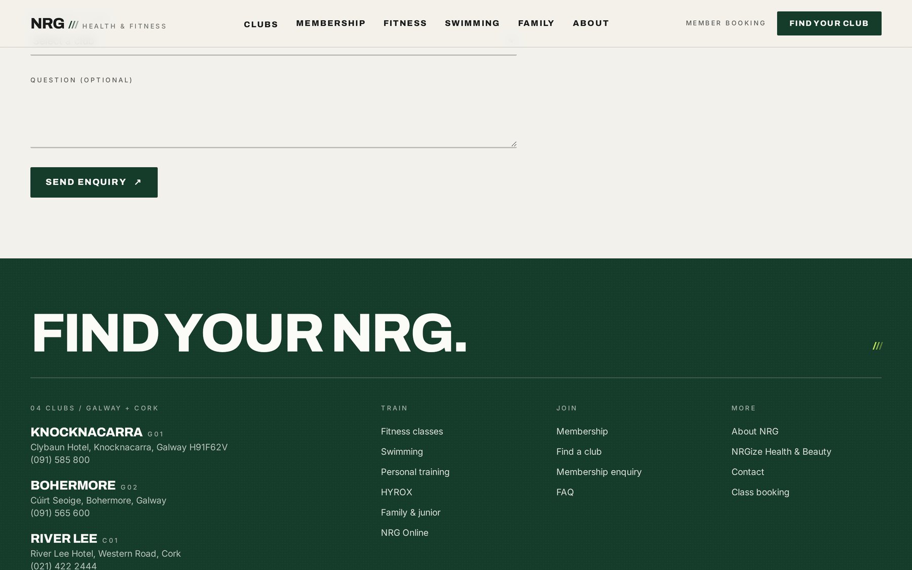
Footer as a directory — every club, every number
07 /Mobile
390px
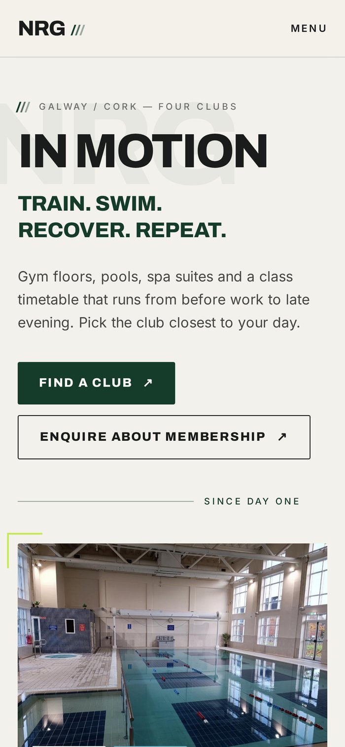
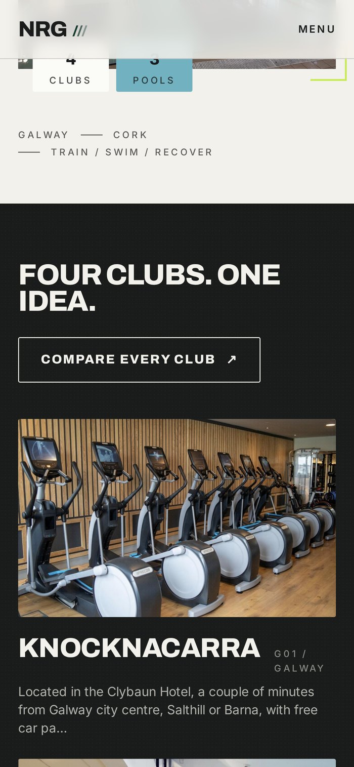
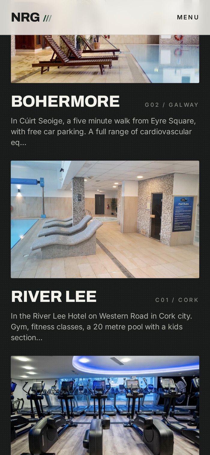
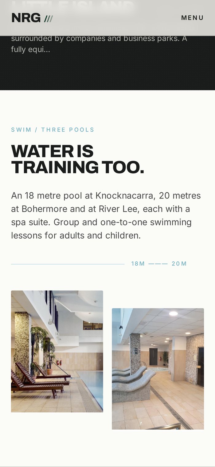
The phone layout is set again rather than squeezed. Choosing a club, checking a timetable and starting an enquiry are each one tap from the top of the screen.
08 /Before → after
Same content. Different reading.
 BeforeAfter / Aucate ↗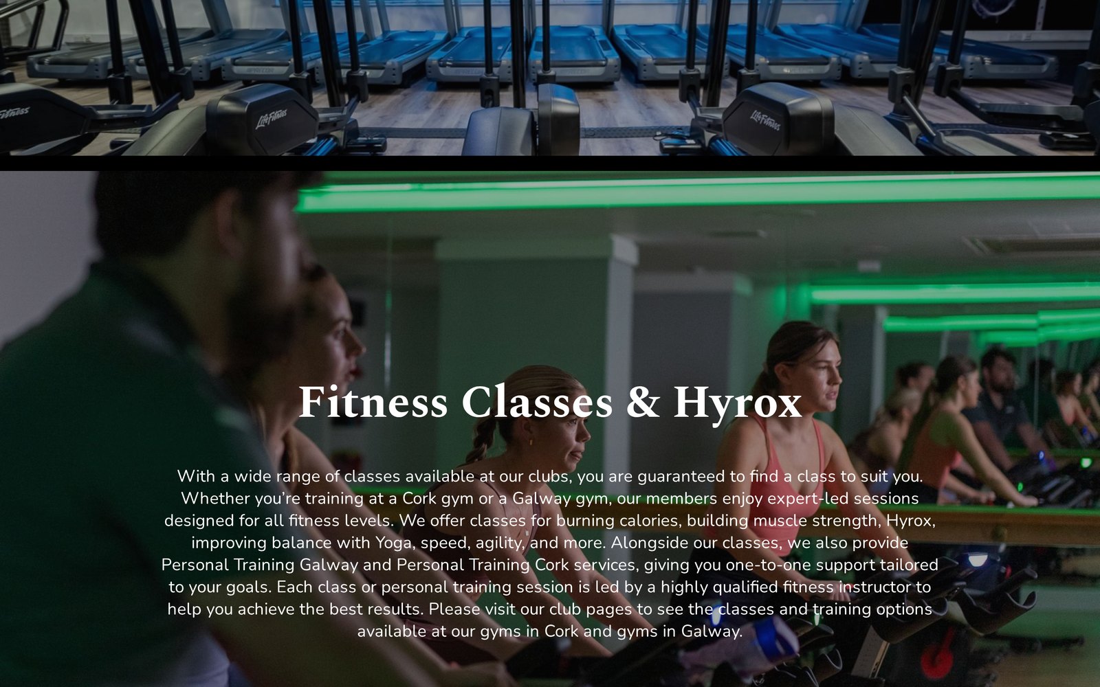
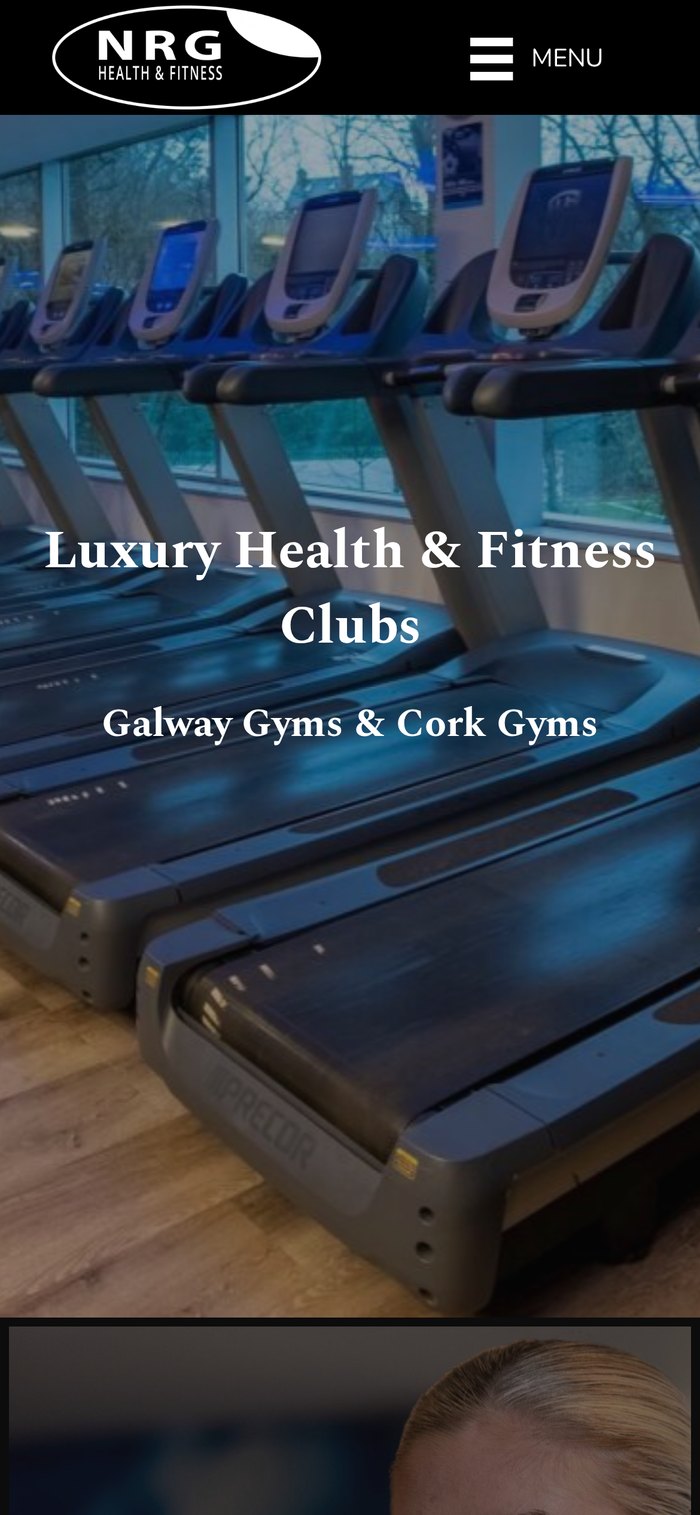
Before — mobile
After — mobile
Nothing was removed from the business. The locations, facilities, classes and membership options are all still there — ordered so a prospective member reaches a decision instead of a wall of text.
Your website
Think your website
could do with
the same?
Tell me about your project. You'll be talking to me, not a sales team.